REAl Estate Wealth Building Sites
Waypoint Designs was asked to creat multiple iterations for a startup company that educates adults nearing retirement on how to enhance their legacy by escalating wealth using real estate.
challenges and objectives
- Client wanted a brand that emitted authority, education, wisdom and trust.
- Client wanted a logo icon that could be recognized by itself without the name.
- Client wanted a look-and-feel as the "go to" source of pre-retirement wealth building
Solution
Client was characterized as a Guardian, a trusted authority of education. Colors of gold and blue were selected to personify a "standard" and "trusted source." Four iterations were acquired, but the the gold logo was selected for signs and the blue/gold embraced as online brand. The triangle logo icon formed from an "L" and "A" is easilly recognizable.
nationwide teacher association and local retail store
Waypoint Designs was asked to create a logo for an agency tasked with innovative ways to teach students and a small retail store that provides Americana-inspired handcrafts and homegoods.
Challenges and objective (TERG)
- Client wanted to create a logo depicting innovation, childhood education and academia.
- Client needed an acronym that could be recognized with a logo
Solution (TERG)
We designed a simple logo using textured colors associated with school-age children (crayon) but a heavier authoritative font for its name. No icon was needed as academia recognizes acronymns so TERG was branded accordingly.
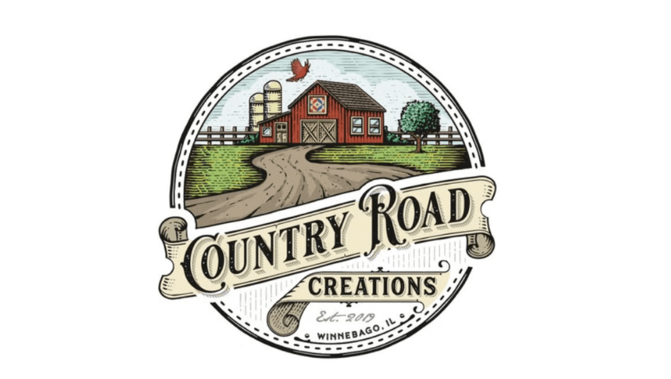
CHALLENGES AND OBJECTIVE (Country Road)
- Client wanted to create a warm and nastalgic design to match the hand-crafted homegoods in its online store
- Client had multiple hand-crafted products so needed a singular name and logo for its products
SOLUTION (Country Road)
Waypoint Designs created an inviting singular logo that can be affixed to apparel, furniture or products. The red barn and green caricuture within a circle of an Americana country road depicted an image of outdoors, nature and warmth.
Health care DNA screening and Health care information technology Consulting fIRM
Waypoint Designs branded a nationwide DNA cancer screening project, of which marketed collaborative services pre-qualify patients, then link them with physicians and laboratories to attain existence of 14 different genetic markers. Also, Waypoint Designs branded a healthcare technology consulting company that positions IT firms for success.
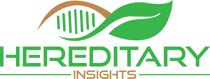
objectives and challenges
- Client wanted a logo icon that would be recognizable on its own
- Client needed an image of trusted advice, guidance and competency to patients
- Client needed a name that described its service
SOLUTION
Waypoint Designs created a name branded to provide an image of DNA, genetic or hereditary insights into a previously unknown result. Green is comforting and brown is earthy/healthy. The emblem can stand alone and the name is recognizable on its own.
OBJECTIVES AND CHALLENGES
- Client provided company direction that enabled IT company's to see the "forest for the trees"
- Client wanted an image of innovation but to be the source of truth and benchmark for positioning products competitively
- Client wanted a Dr Spock image of wisdom
SOLUTiON
Waypoint Designs created a logo that looked like rays of light (unique paths) emitting from a sphere of choices. The blue/gray colors stand for strength, stability, and wisdom. The name brand can stand apart from the emblem logo.